Sunday, November 20, 2011

Geog7-Lab7: Census 2000/2010


This map is showing the percentage of black in the US on the basis of counties in 2000. Notice that high percentage counties, from 50% up to 86.5%, are mainly located on the southwest coast due to historical event of immigration. Since the map is based on percentage, there are counties that only have several thousand people, but a huge percentage of black, whereas some big counties have huge population, but a small percentage of black. In other words, the deeper color does not imply greater number of black directly.


This map is showing the percentage of Asian in the US on the basis of counties in 2000. Notice that the main portion of Asian, from 10% up to 46%, is distributed along the west coast(mainly California), the Mississippi river and some parts of the east coast. The high percentage on California makes sense: we see a lot of Asians in our school every day! The high percentage on the Gulf of Mexico resulted in the immigration of Asian refugees from the World War II.


This map is showing the percentage of some other race in the US on the basis of counties in 2000. As indicated by the definition provided by the US Census, this category mainly consists of Hispanic and Latino Americans such as Mestizo and Mulatto. This is not a standard category since it depends on how the prior categories are defined. Notice that high percentage of some other race, from 15% up to 40%, is distributed on the southwestern part of the country.  


Overall, this project is based on data from 2000 US Census. Notice that the legend scale of each map is made to be different because of concerns of clarity. From the scales we can conclude that among those three categories, black has the largest proportion of people in the US. There are some counties that are “blank”, indicating that no one of that certain race lives in that area. Interestingly, same for all three maps, the coast is where large portion of immigrants live and thus large percentage of those race.


ArcMap is really helpful in combining graphics with data. Data can be collected county by county and presented in a table (either in the form of .xls or .dbf). Also, ArcMap makes it possible to convert xls files into dbf files and then apply it to the county layer. When I was joining attribute table of the county layer to the 2000 Census data I found out that in some counties, the percentage of certain race is presented to be “null”. This is because those counties do not appear on the raw table (.xls), indicating that no one of that race lives in that area.

Saturday, November 12, 2011

Lab6: DEMs in ArcGIS

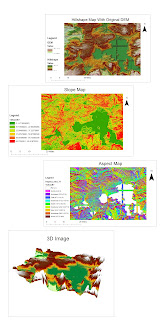
These are maps of the center of Yellowstone National park in Wyoming and the west part of the Yellowstone Lake. The datum used is the North America Datum 1983. The geographic coordinates of the left top corner are 44.6989 degree North, 110.8258 degree West, and the geographic coordinates of the right bottom are 44.2475 degree North, 110.1708 degree West. Notice that, on the Slope Map and the Aspect Map, there are some places where they are indicated to be flat. This area is part of the Yellowstone Lake.

Monday, November 7, 2011

Geog 7 - Lab 5 - Projections in ArcGIS

Different map projections can make a big difference. This project is designed to illustrate examples of 3 different kinds of map projection: conformal, equal-area and equidistant projections.


According to GCS WGS 1984, which is the current reference system being used by GPS, the distance between Washington D.C. and Kabul, Afghanistan is 6,934.478105 miles.


Notice the scale bars in some maps are different from others due to clarity concerns.


a)      Equal-area projections  
Mollweide Projection 


“The Mollweide projection is a world map projection that minimizes area distortion while sacrificing the accuracy of shape and angle. It is a representation of the world map on an ellipse with a 2:1 ratio. Although it is not widely used today, the Mollweide projection has been influential in the development of other projections.” (Mollweide Projection page, wiki.gis.com) The distance measured on Mollweide projection between Washington D.C. and Kabul is 7,925.557346 miles.


Sinusoidal Projection


“The Sinusoidal projection is an equal-area world map projection that has straight, horizontal parallels spaced equally at their true distances. The central meridian is straight, and the others are curves that derive from a true division of each parallel.”(Sinusoidal Projection page, wiki.gis.com) The distance measured on Sinusoidal projection between Washington D.C. and Kabul is 8,098.076483 miles.


b)      Equidistant projections
Azimuthal Equidistant Projection


“Azimuthal equidistant projection is a map projection in which all distances measured from the center of the map along any longitudinal line are accurate, however, distances and directions to all places are true only from the center point of projection. Distance measurements are accurate between points along straight lines through the center. All other distances are distorted and thus incorrect. Distortion of areas and shapes increases with distance from the center point.”(Azimuthal Equidistant page, wiki.gis.com) The distance measured on Azimuthal equidistant projection between Washington D.C. and Kabul is 8,341.411788 miles.


Two-point Equidistant Projection


“The two-point equidistant projection is a map projection first described by Hans Maurer in 1919. Distances from any point on the map to two control points scale to the geodesic distances of the same points on the sphere. The projection is commonly used in National Geographic Society atlases for maps of Asia, and it sometimes appears in diagrams of air routes.”(Two-point Equidistant Projection page, Wikipedia) The distance measured on Azimuthal equidistant projection between Washington D.C. and Kabul is 6,648.754559 miles.


       c) Conformal Projections
     
         Stereographic Projection


“In geometry, the stereographic projection is a particular mapping (function) that projects a sphere onto a plane. The projection is defined on the entire sphere, except at one point — the projection point. It is conformal, meaning that it preserves angles. It is neither an isometry nor area-preserving: that is, it preserves neither distances nor the areas of figures.” (Stereographic Projection page, wiki.gis.com) The distance measured on Stereographic projection between Washington D.C. and Kabul is 9,878.038997 miles.


Hotine Projection


“The Hotine (Oblique Mercator) world map projection is a cylindrical, conformal map projection.” (Hotine Projection page, wiki.gis.com) The distance measured on Hotine projection between Washington D.C. and Kabul is 9,628.552081 miles.


Different kinds of map projections preserve different properties. For instance, conformal projections preserve angles between two lines; equidistant projections preserve ratio of two distances; equal-area projections preserve ratio of two areas.


Map projections must have some distortion. For example, in two-point equidistant projection, the South Pole is bigger than Africa; in Hotine projection, the area of the US is much larger than that of Asia!


According to the properties of their projection, maps projected differently can be used in various circumstances. For example, Sinusoidal equal-area projection is frequently used in atlases to show distribution patterns and often used by the USGS to show prospective hydrocarbon provinces and sedimentary basins of the world; Stereographic projection is by the USGS for maps of Antarctica and American Geographical Society for Arctic and Antarctic maps; Azimuthal equidistant projection is useful for showing airline distances from center point of projection and useful for seismic and radio work.(Map Projections, USGS, http://egsc.usgs.gov/isb/pubs/MapProjections/projections.html).


On the contrary, maps projected differently may be used by people such as businessmen and politicians to give the public a biased view of the world. For instance, politicians may have their maps projected to show the degree of poverty. Some maps would overestimate and some would underestimate the situation. In this case the public are not aware of the truth.